Grey Scale
- Home
- Grey Scale
How it works, how to use it, and why it's so useful.
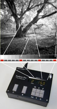
The patented grey scale display on our Analyser and ZoneMaster products provides a unique way to previsualise a print without tedious test strips and proof prints. When the units are properly set up for your materials and methods, each time you take a spot light measurement from the image projected on the enlarger baseboard, an LED will light up alongside the equivalent grey tone on a print made with the current settings of exposure time and paper grade. If you then adjust those settings, the grey scale display will indicate the new tonal range of the print. Typically, therefore, you can spot meter a highlight and a shadow area, and then choose the paper grade which places those readings at the extremes of the grey scale. This will give a print with a full range of tones.
But it doesn’t end there; the Analyser and ZoneMaster (for the remainder of this article we’ll simply use the term “meter”) can also help you with important mid-tone placement, burning in and dodging exposures, fogging and flashing exposures, and lots more besides. The four keys marked with arrows on the front panel of the Analyser shown above are the paper grade and exposure controls, grade (contrast) on the left, and exposure (brightness) on the right. The extremes of the grey scale itself are not paper base white and maximum black; rather, they represent the points beyond which detail is starting to be lost. In Zone System terms, the scale can be considered to cover Zones 2 – 8 in half zone steps approximately. If a measurement results in an extreme white or black, the corresponding LED will flash.
Basic Use.
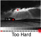
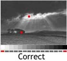
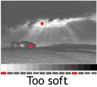
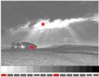
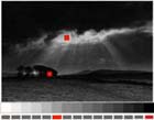
The simplest use of the meter is to determine an appropriate paper grade and exposure time, based on two readings, one bright highlight and one deep shadow. The meter will calculate a suggested exposure based on the highlight reading, and illuminate the LED at the white end of the scale and another one at the black end. In these three examples, the spot readings are indicated by the red squares and the paper grade setting is shown correct (centre), too hard (left – the black end LED flashes) and too soft (right – the black end LED is indicating a dark grey):
It is also possible to override the meter’s suggested exposure if you prefer an overall lighter or darker print, as shown in these examples:
So you can see that you have full control over the appearance of your print – the meter is not “automatic”! If your image does not have bright highlights, or deep shadows, you can place the extreme readings exactly where you want them by adjusting the meter’s controls until you’re happy with the grey scale’s indications. Then, select the appropriate grade of paper or set your enlarger’s filtration, and expose the paper for the indicated time. A print with the indicated range of tones will be the result!
Burning in exposures.
A familiar problem, particularly to the landscape photographer, is the presence of an area in the negative which is much denser than the remainder such as a bright sky. Metering the sky and the deepest shadows usually results in the mid tones being squashed up against the black end of the grey scale and this would produce a most unsatisfactory print. If the desired result is to have black shadows with mid grey grass and detail in the sky, it is unlikely that you can achieve this with one exposure. This is where the meter excels.
Take readings from the sky, the shadow area, and the important mid tones. Positioning the extreme measurements at the ends of the grey scale results in the mid tones being displaced too far to the dark end of the scale (see diagram a below). Ignore the sky reading for the moment. Increasing the grade setting (from 2 to 5 in the diagram) will separate the mid tones and shadow areas but will result in the extreme LEDs flashing to warn of detail loss. Decrease the time setting until LED representing the darkest shadow area just stops flashing. The mid tones should now be close to the required shades of grey. Continue to adjust the grade and exposure settings until these tones are where you want them (diagram b). We’ll call the resulting exposure time T1 for reference. In the diagram, it’s 2.5 seconds. Expose the whole of the paper for this basic exposure time. If you processed such a print the result would be correct in the mid and dark tones but of course the sky is completely washed out.
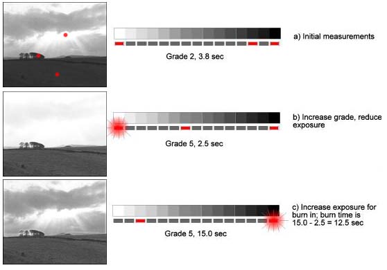
Now increase the exposure time until the LED representing the sky area stops flashing, or until it lies adjacent to the required sky tone (diagram c). The new exposure time indicated is that required to place that sky tone at the desired level. Call this time T2. In the diagram, it’s 15.0 seconds. If you’re using an Analyser Pro simply press and hold the Print button for one second. The timer will compute the burn-in time for you by subtracting the original T1 exposure from the indicated T2 time, and after a delay of a few seconds allowing you to pick up your masks etc, will expose the paper for the burn-in time only! Otherwise, work out the difference between T2 and T1; this is the burn in time. In the diagram, it’s 12.5 seconds. Set the exposure time to this time, mask all of the print except the sky area to be burned in, and expose the sky. With practice, you will find that you can control individual areas of the print very accurately using this method. You can use this burning-in technique as many times as you like on the same print; the Analyser will remember the T1 exposure time and subtract it on each burn-in exposure.
Portraiture.
The skin tones in a Black and White portrait are critical. After using the meter for a short while it will become apparent which print tones best represent skin highlights and shadows. By altering the contrast and exposure settings it will be possible to place the skin tones, clothing and backgrounds on the required grey tones, and the meter will indicate any requirements for burning or dodging in less important areas of the image.
If your portrait (or any other image for that matter) doesn’t have a bright highlight, or a deep shadow, remember to place the extremes of the tonal range away from the ends of the grey scale, otherwise your print will have too much contrast. This is commonly overlooked by new users of the system!
Remember that an increase in grade will widen the gap between two tones, but may require some dodging and/or burning in to restore the correct tones in other areas. The reverse is of course also true. After some experience you will learn the feel of the various controls and how they interact, allowing you to control the exact appearance of the print with minimum effort.
Other uses.
The meter can be used to determine contact sheet exposures simply by taking a reading through film base+fog and increasing the exposure time until the extreme black LED starts to flash. Equally, flashing and fogging exposures can be determined by taking a reading through a blank negative and reducing the exposure until the extreme white LED is lit (fogging) or flashes (pre-flashing).